

In January of 2004, Luke Mewburn of the NetBSD Foundation announced a design competition for a new NetBSD logo. I heard about it on the netbsd-advocacy mailing list.
Here's an excerpt from Luke's post in which he identifies some of the shortcomings of the old NetBSD logo and some possibilities for the design of a new one:
The following problems have been identified with the current identity:
- Too complicated.
- Hard to reproduce.
- Has negative cultural, and religious ramifications.
Some suggested themes for the new identity include:
- An animal character such as the Linux `Tux' penguin (4) or Darwin `Hexley' platypus (2).
- An abstract symbol conveying the goals and spirit of open source technology.
- A logo based on the letter-forms of the organization name (NetBSD).
The old logo
The old NetBSD logo was well-known in the BSD world and pretty well-loved. I liked it a lot. The symbolism in the old logo was unmistakable: A bunch of little daemon processes doing something significant on a hodgepodge of old, broken, and diverse hardware. The problems with the logo are obvious too: the pen sketch is hard to reproduce, doesn't scale well, and its ragged edges don't look professional; there's way too much going on at once; and most people assume that d(a)emons are evil.
Designing a new logo
I thought for a long time about what a new logo could say about NetBSD, the world's best OS. It's surprisingly hard to work subtle symbolism into a design!
Qualities I wanted to portray:
Stability
NetBSD is known for its stability (except for -current on my DEC-Alpha PWS500a!), so if possible the logo should imply stability.
Cross-platform compatibility
In my opinion, this is NetBSD's greatest feature. There aren't many OSes that run on two dozen platforms. This is a hard quality to represent graphically.
Demon-ness (demonocity?)
Everyone loves the BSD daemon, so a pointy tail or some horns like the original logo's would be nice, but would also be very hard to pull off in an politically-correct way. Fortunately, "demonocity" is a less-critical requirement.
Mascotability
I seem to be making up a lot of words. What I mean by "mascotability" is that it would be cool if the logo could also function as a mascot like Linux's Tux. To do this it needs to be a character or some other entity that has personality.
I spent a long time thinking about ways to incorporate those ideas into a logo that was simple, lovable, easily reproducible, and that could also be a mascot.
At first, I liked the idea of a mountain-shaped logo. Mountains are stable, just like NetBSD. They look stable to us because we know they're really big and because they're shaped like triangles. Or maybe triangles look stable because they're shaped like mountains? Anyway, a mountain is rock-solid.
The biggest problem with the mountain-themed logo was that I couldn't figure out a way to relate a mountain to NetBSD. Also, a mountain isn't cross-platform compatible and it can't serve as much of a mascot. I decided pretty quickly that a mountain theme wasn't such a good idea. (Besides, because a lot of companies use mountains in their logos, I was afraid I would infringe accidentally on someone's trademark.)
After the failed mountain idea I worked on a bunch of others. I sketched bunches of designs and I think several were pretty good, but it took me a couple of days to find one I really, really liked.
My entry
The idea I really latched onto is not a new one, but is instead a new face on a well-established concept.
Everyone knows the joke about the toaster that runs NetBSD. "Why not?" asked a famous t-shirt depicting such a toaster. After all, it runs on everything else. NetBSD's users have created this association lovingly. There's a NetBSD/Toaster port and someone even built the real thing.
All joking aside, a toaster really does embody some of NetBSD's most valuable traits:
- It's dependable
- It's simple
- It's portable (okay, this is stretching)
- It's friendly (definitely not evil), recognizable, and familiar
- Anyone can use it
In light of these reasons and after much thinking, design, and revision, here's my entry. It's simple, cleanly designed, and totally evil-free. I hope it's a symbol that people can love, too.
Users in the know will recognize the BSD daemon's forked tail, but those who don't know about the daemon won't assume NetBSD is evil. To them, it's just a power-cord that adds a feeling of motion to the design. I hope that the tail also adds enough character to allow the logo double as a mascot when separated from the "NetBSD" text.
The type is in the distinctive Adobe Warnock face, but another classy face would do just as well. I did the kerning (letter spacing) by hand to make "Net" roughly the same width as "BSD" for balance, but the lettering would probably have to be readjusted for print production to keep the letters from bleeding together where they're very close.
I chose the Warnock face partly because I think it looks good and partly because it exists in so many weights (twenty or so). Multiple weights are important when the image must work as well in an icon as it does on a t-shirt. (For what it's worth, the weight of the tail and its prongs can also be adjusted in the Illustrator document. Those would also require adjustment at very small sizes.)
 not useful
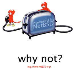
Comments
Post a comment about this page
The new logo
Posted by Hugh Jorgan, Monday, November 1, 2004 at 5:45 am
The new logo that NetBSD actually chose to use isn't good. I don't hate it, but I don't love it either. Why can't we hear what that logo's designer says about it?
logo
Posted by austin, Monday, November 1, 2004 at 8:39 am
I like it - I think it speaks to NetBSD's roots. I think they really missed out on a winner.
Nice
Posted by Andy Ball, Tuesday, November 2, 2004 at 10:31 am
I prefer this to the logo that was selected as the "winner".
Very nice !
Posted by Julien Gabel, Thursday, November 4, 2004 at 4:13 pm
I really appreciate your though and the way that drive you to this wonderful logo. I can just agree with all of the other comments: i think this one was much better appropriate for The NetBSD Project. Good work, really.
Your logo entry
Posted by Tim Kelly, Friday, November 5, 2004 at 12:24 pm
I like it. I think it conveys a lot about NetBSD. Personally, I'm tired of the animal mascots and cartoonish beasties. I think your logo would have shown quite a bit of differentiation from the other OSes. It is both amusing and professional at the same time.
toaster logo
Posted by Tai Ngo, Friday, November 12, 2004 at 1:50 pm
Your design comments and actual design are definitely more inspiring than the new logo that was chosen as the NetBSD logo of the future. I would personally prefer some sort of toaster and daemon portrayal in the new logo rather than a meaningless orange flag, both boring and lame.
Ambiguous?
Posted by Grant McGinnis, Friday, December 10, 2004 at 10:29 am
I appreciate the cultural reference and the subtle hints to our beloved daemon, but I think those who are unaquinted with the project would be more likely to associate a toaster with electrocution than a supported platform.
Lets Toast ` IT `
Posted by Suresh, Friday, August 12, 2005 at 6:45 am
Great, the words derive the stability , robustness as well as technology !
We love this !
No new comments may be posted.